There are four ways to separate a design for screen printing. The artwork and the shirt color decide which one fits, before any setting does. Pick the wrong one and you either spend screens you did not need or print a photo that turns to mud.
The short answer
| Artwork | Light shirt | Dark shirt |
|---|---|---|
| Logo, type, flat color | Spot color | Spot color + white underbase |
| Flat color with a few gradients | Spot color with halftoned tints | Spot color + underbase |
| Photo or painted art | CMYK | Simulated process or index |
| Photo, manual press, loose registration | Index | Index |
Spot color
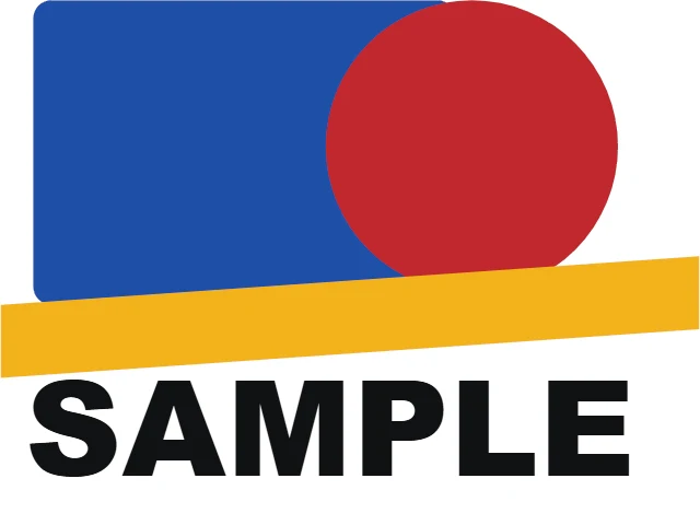
One screen per ink, each ink mixed to the color you want. It is the everyday job: logos, type, team names, flat illustration. Most spot inks print solid. Where an ink has a gradient or a shadow, that part is halftoned, and the solid parts keep clean edges.
- Screens: one per color, plus a white underbase on a dark shirt.
- Good at: exact brand colors, hairlines, small type.
- Watch for: colors that sit side by side need a trap, so the shirt does not show in a gap between them. See trapping.
Simulated process
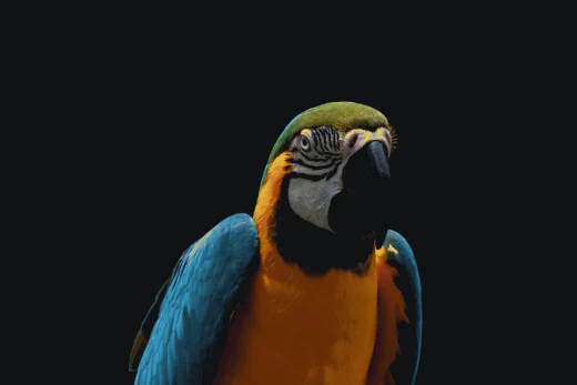
A photograph or painting separated into a handful of opaque spot inks, each one halftoned. Because the inks are opaque, it works on black and other dark shirts where CMYK cannot. The shirt itself often stands in for black.
- Screens: usually more than a spot job: white, the main colors of the image and sometimes a highlight white.
- Good at: photos and full-color art on dark shirts.
- Watch for: it lives or dies on the ruling. 45 to 55 LPI is the usual window. See simulated process on dark shirts.
Index
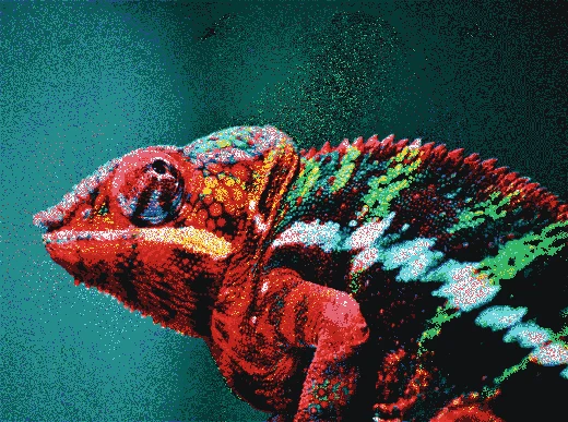
The image is dithered onto the ink set as square dots that are all one size. There are no angles, so nothing beats against the mesh and there is no moiré. That makes index the forgiving choice on a manual press, and when the shop has more inks than the art strictly needs.
- Screens: often more than sim process, because each extra ink buys smoother color.
- Good at: photos with no moiré risk, loose registration.
- Watch for: an index dot is all ink or all clear, so art that fades into the shirt does not fade smoothly. See index separations.
CMYK (four-color process)
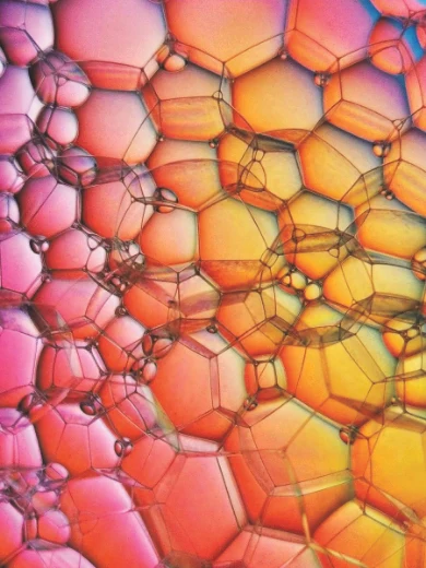
Cyan, magenta, yellow and black, the same four inks as a magazine. Translucent inks mix optically, so four screens make a full range of color, but only on a white or very light shirt. On a dark shirt CMYK needs a white underbase and still loses saturation.
- Screens: four, plus an underbase on anything darker than white.
- Good at: photos on white shirts with few screens.
- Watch for: screen angles and moiré, total ink on the shirt, and colors CMYK simply cannot reach, such as a pure bright blue. See halftone angles and moiré.
How CMYK prints a gray from three inks, or from black alone (more video lessons):
How to decide on a real job
- Is the art flat or continuous tone? Flat art is spot color, almost always.
- What color is the shirt? White or light: CMYK is on the table for photos. Dark: sim process or index.
- How many screens can your press take? A six-color press rules out a ten-screen sim job.
- How tight does your press register? Loose registration favors index, then spot with generous traps.
Whichever you pick, the films have to deliver the same things: see what a finished separation needs.
In Halftoned
Drop the file and pick the shirt. The Prep step reads the art and suggests a method: spot for flat art, CMYK for a photo on a white shirt, sim process for a photo on a dark one. You can change it in one click and compare. All four methods are in Studio. See the preview or the pricing.